Wear & Care
Color is one of the few parts of your uniform that still feels personal. Even within dress codes and approved palettes, the shade you choose can influence how you feel stepping onto the floor. It’s a small choice, but one that stays with you through every patient interaction, every hallway and every hour of your shift.
That’s why brighter colors can feel like a bigger commitment. You want a shade that feels fresh, not distracting—confident, not attention-seeking. When you land on the right one, a bright scrub color wears effortlessly, looks polished under hospital lighting and blends seamlessly into your day once the work begins. This guide is here to help you find that balance, so choosing color feels just as practical as it does personal.
What Counts as “Bright” in Everyday Scrub Wear
“Bright” doesn’t automatically mean neon. In everyday scrub wear, brightness usually comes from saturation, not intensity. A color can feel bright because it’s rich and clean-looking — not because it’s loud or attention-grabbing.
Think about the difference between a deep royal blue and a washed-out pastel. Both are noticeable, but one tends to read sharper and more polished on the floor. Many nurses find that saturated shades look more intentional and hold their appearance better through long shifts.
It’s also worth remembering that brightness is relative. A shade that feels bold next to navy or black can feel completely normal once you’re surrounded by other scrubs. That’s why choosing a bright color often comes down to how it looks and feels on you—not how it looks on a hanger or a screen.
How to Choose the Right Bright Shade for You
Once you’re working within an approved palette, choosing a bright shade becomes less about color rules and more about how that shade fits into your day.
Start With Colors You’re Already Allowed to Wear
Most nurses are choosing within a set color family, not starting from scratch. If you’re approved for blue, green, purple or pink, the decision usually comes down to which version of that color you wear.
Small shifts make a difference:
- Lighter brights can feel more playful but may show wear faster
- Deeper, saturated shades often feel more polished and forgiving
Consider How You Want to Feel During Your Shift
Color doesn’t change how well you do your job, but it can influence how you feel while doing it. Some nurses gravitate toward calming shades for long shifts, while others prefer colors that feel energizing when fatigue sets in.
There’s no right answer. The best shade is the one you stop thinking about once your shift begins
Bright Scrub Colors: Practical Trade-Offs Nurses Actually Care About
Different bright shades behave differently once you’re actually wearing them to work. Lighting, wear and how a color holds up over time can all affect whether a shade feels easy or distracting during a shift. Here’s how some of the most common bright scrub colors tend to show up in real-world settings.
Royal & Caribbean Blue
Blue-based brights like Caribbean blue or royal blue scrubs are often among the easiest colors to wear. They read clean and steady, coordinate easily with other pieces and tend to feel professional without much effort. For many nurses, these shades offer color without feeling like a departure from classic scrub tones, which makes them a reliable choice for long shifts.


Teal & Green Tones
Teals and green-based brights tend to land in a comfortable middle ground. They feel noticeable without drawing too much attention and often read fresh while still blending easily into clinical environments. Many nurses gravitate toward these shades when they want color that feels modern but still grounded and easy to wear throughout the day.


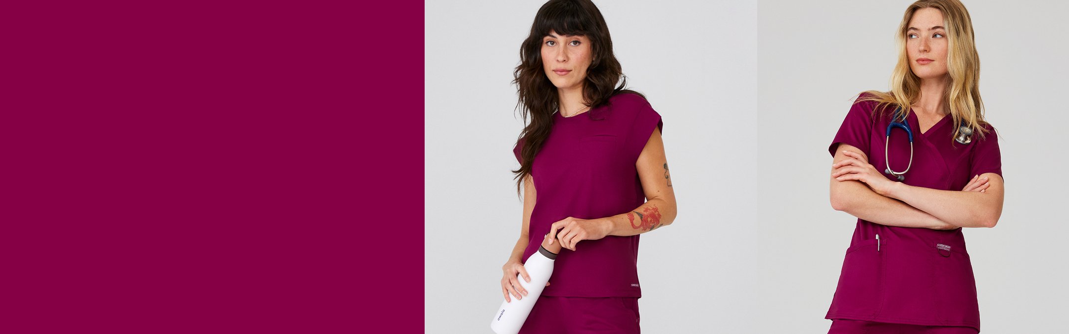
Purple, Wine & Berry Shades
Deeper brights like purple, berry and wine scrubs offer a more saturated take on color. These shades often feel polished and intentional, especially compared to lighter brights. For nurses who want to wear color while still feeling pulled together, deeper tones can be an easy way to strike that balance.


Pink, Coral & Rose Hues
Pink, coral and rose shades can feel warm and uplifting, but how they wear can vary by tone. Softer pinks often read calm and approachable, while deeper rose or coral tones tend to feel a bit more saturated and defined on the floor. The key is choosing a shade that feels balanced on you.

Cherokee WW Revolution
$53.00
1 Color


How Bright Colors Look on Different Bodies
The way a bright shade looks can shift depending on skin tone, fit and how the garment moves with you throughout the day. While certain colors may stand out differently from person to person, what matters most is how a shade feels once you’re wearing it for hours at a time. If it looks good to you and feels comfortable, that’s usually the best indicator.
Fit plays an even bigger role. A bright color tends to read more polished when the silhouette feels right, whether you prefer something relaxed, classic or more streamlined. Choosing a cut that moves well with you can make bold shades feel effortless and work-ready. If you’re browsing options, we offer a wide range of fits across both women’s scrubs and men’s scrubs, making it easier to find the right balance between color and comfort.
Frequently Asked Questions About Bright Colored Scrubs
Do brighter colors fade faster?
They can if they’re not cared for properly. Washing scrubs in cold water, turning them inside out and avoiding high heat can help preserve color and keep shades looking vibrant longer.
Do bright scrubs draw unwanted attention?
Usually only when they’re uncommon in your setting. Widely worn shades like navy and ceil blend in more easily, while less common colors naturally stand out more. What feels noticeable often depends on what you’re surrounded by every day.
Which bright colors hide lint or wrinkles better?
Mid-to-dark saturated colors generally do a better job masking lint and wrinkles than very light shades. Fabric and finish also play a role in how polished a color looks throughout the day.
Are there bright colors that feel easier to wear during long shifts?
Yes. Many nurses find that deeper brights like royal blue and teal are easier on the eyes over long hours than very light or high-contrast shades.
Can bright scrubs still feel polished at work?
Absolutely. When the color feels intentional and the fit is right, bright scrubs can look just as polished as neutrals.
When Bright Scrubs Feel Right — and When to Dial It Back
Patient-Facing vs. Behind-the-Scenes Roles
Visibility and interaction levels can influence what feels comfortable. Some nurses prefer brighter shades when they want to feel approachable, while others lean toward deeper colors for roles that require a more subdued presence.
Long Shifts vs. Short Clinic Days
What feels great for a four-hour clinic day may feel different during a twelve-hour shift. Comfort and mental ease often matter more the longer you’re wearing it.
The Best Shade Is the One You Don’t Have to Think About All Day
The right bright scrub color doesn’t distract you, slow you down, or make you second-guess yourself. It just works — with your body, your role, and your day.
If you want to explore how color is commonly interpreted in healthcare settings, you can also read our guide on Scrubs Color Meaning for additional context as you narrow down what feels right for you.